Portfolio / S7 Itinerary Review
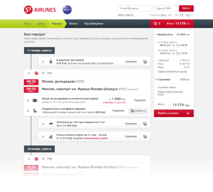
S7 is one of Russia's largest airlines. The company operates to 150 destinations within Russia and internationally. S7 Airlines asked me to propose improvement ideas for the itinerary review page. The page allows S7 customers to review the selected flight itinerary and add ancillary products.
My Role
I conducted a series of interviews with S7 customers and frequent travelers to find possible bottlenecks and errors to improve the itinerary review page.
What I did
- Interviews
- User Flows
- Mockups
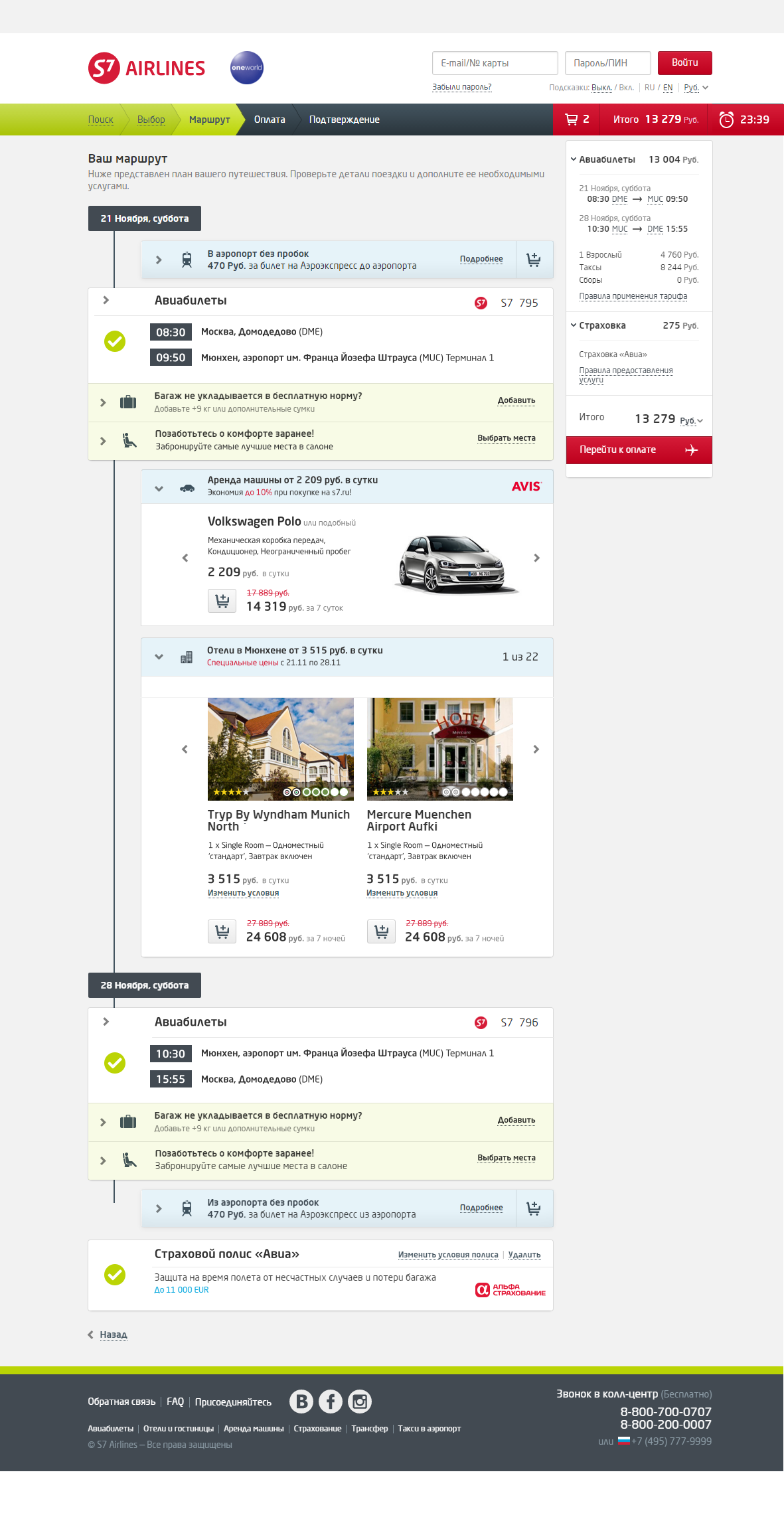
I found that unfolded ancillary offers had unnecessary options and information that diverted visitors away from the goals. The services which were already booked, get lost in the total list. Red plates for Departure/Arrival time in the ticket looked like a warning or urgency, so users thought they were late for the departure or check-in.
There was no visual difference between main services and ancillary products. The users had feelings that ancillary products are obligatory for buying and not optional. The same products on the itinerary page and in the shopping cart had different names. There was no logic in the design of similar products: different buttons for the same actions, different font sizes, etc. Some of the elements were even not properly aligned.
One of the client's requirements was not to change the visual design too much and, if possible, keep the used components. So I tried my best to deliver the concept meeting these requirements. After research I came up with several ideas:


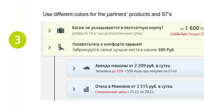
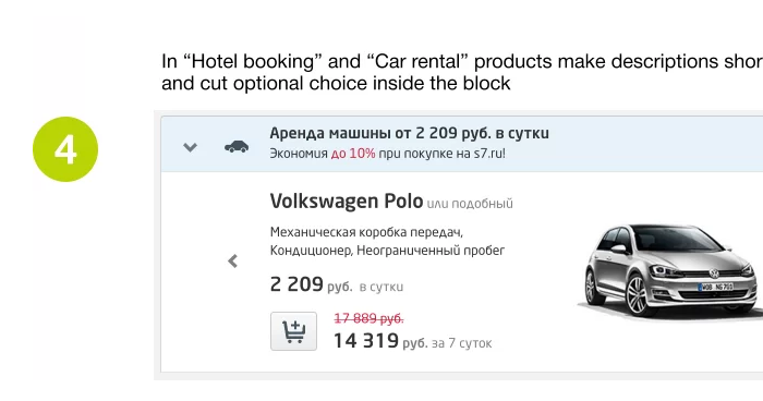

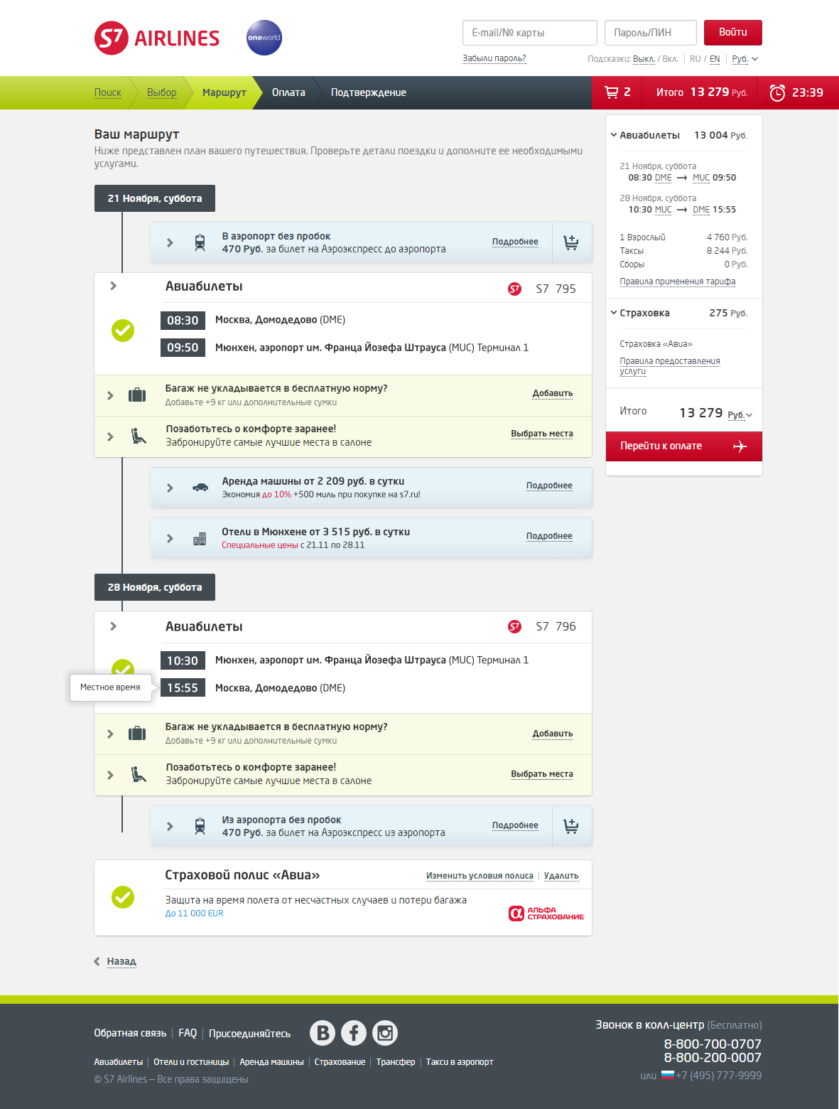
I made mockups showing my ideas of improvement:
Another idea was to "let user flow":

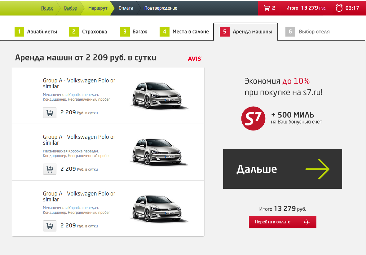
The main goal of this idea is to remove distractions and let visitors focus on a single action. I split the itinerary page into a set of single screens. Now the user could be more focused on his goals and skip unnecessary products or services.

Anton possesses a winning combination of solid tech skills and business sense. He has an expert knowledge of user behavior, needs and pain.
— Rossano Rolla, De Fonseca

Anton quickly and efficiently achieves his goals thanks to his responsibility, focus on results, deep understanding of user needs.
— Sergey Doroshko, LETO

Anton is a clear expert who has a vast knowledge of UX and demonstrates a deep understanding of users.
— Roman Soroka, KupiVIP

Anton has an excellent eye for design and usability, he is a self-starter and a problem solver.
— Kirill Semkin, Spacebox