Portfolio / KFC Russia Website
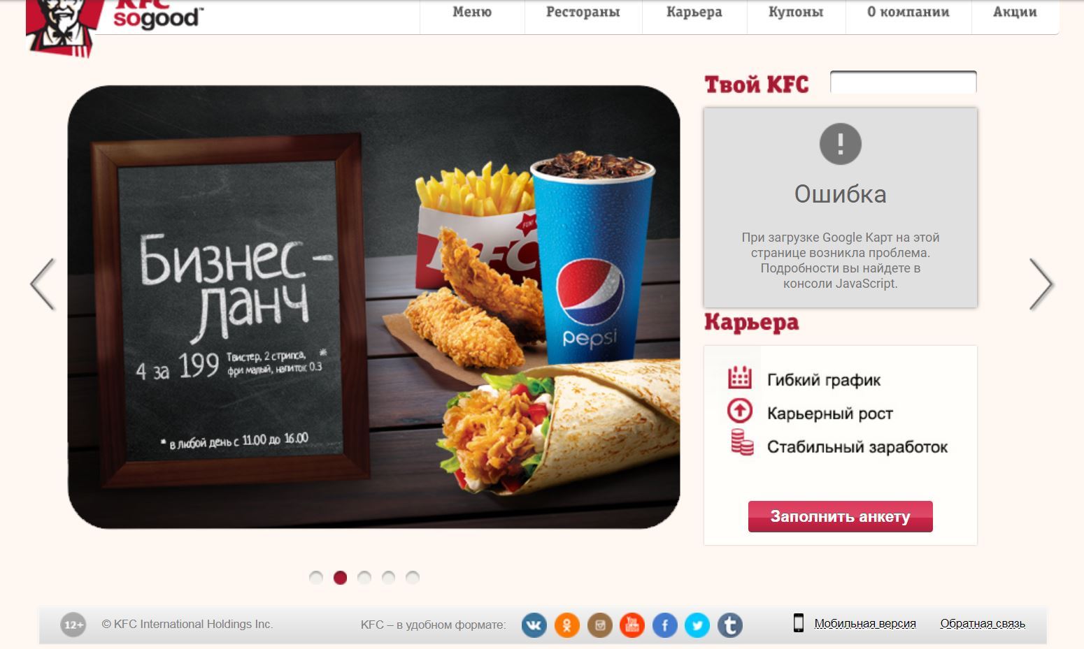
Russia is one of the major markets for KFC. KFC dominates the fried chicken segment of the Russian fast food market, with over 960 restaurants. The Russian division is second only to China in terms of sales growth. At the same time, the KFC website was outdated and did not perform main conversion tasks well:
My Role
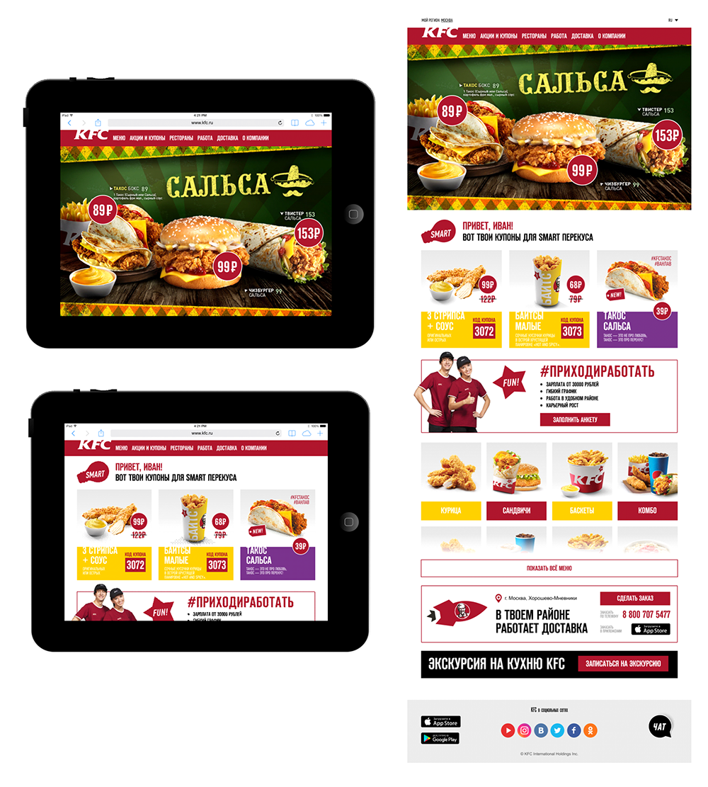
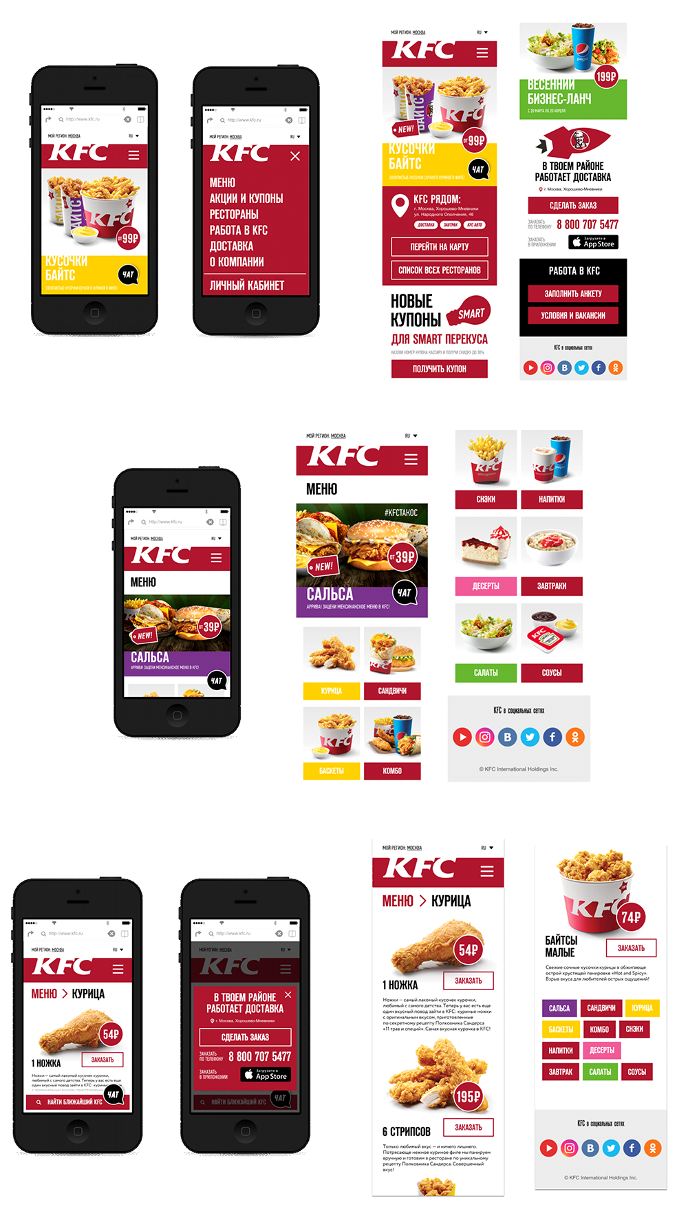
The LETO agency was asked to design a new KFC website. I was responsible for the user experience and visual design of the new website. I led the work, producing all major deliverables and presenting these to the client.
What I did
- Interviews
- Analytics
- Personas
- User Flows
- Wireframes
- Mockups
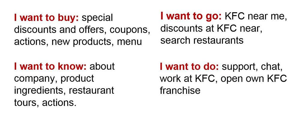
To redefine the architecture of the website and user flow I used Google Analytics data. To collect more data, I compiled a list of questions and run an online survey using Google Forms. Also, I gathered frequent KFC goers from the agency and asked them to talk about their experience of interacting with KFC, their preferences, methods of ordering, etc. The surveys and interviews revealed four main customer groups with different user scenarios.
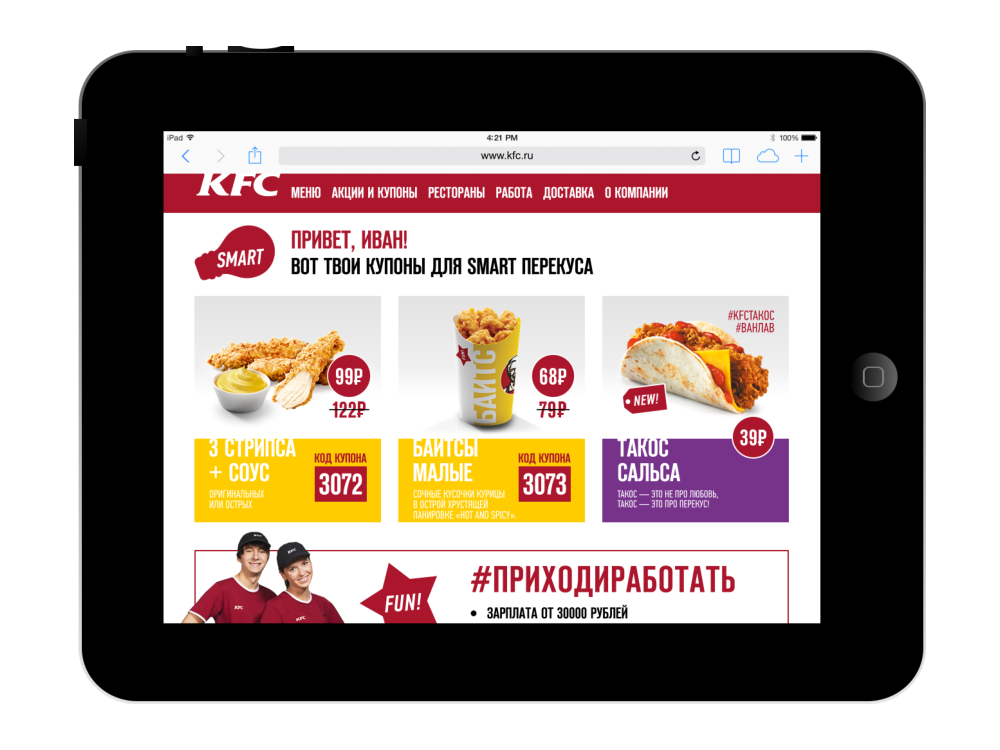
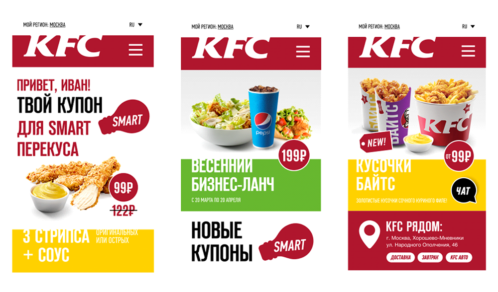
Using the data accumulated in KFC, as well as third-party sources and external APIs, it was possible to display the unique frontend for each visitor. When a user opens the website, he sees personalized content that suits his interests.
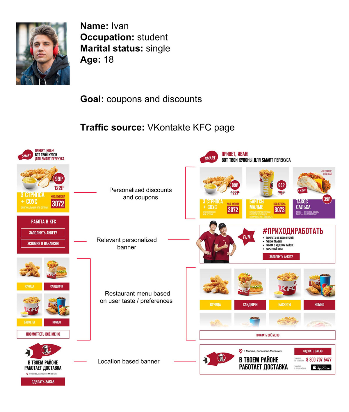
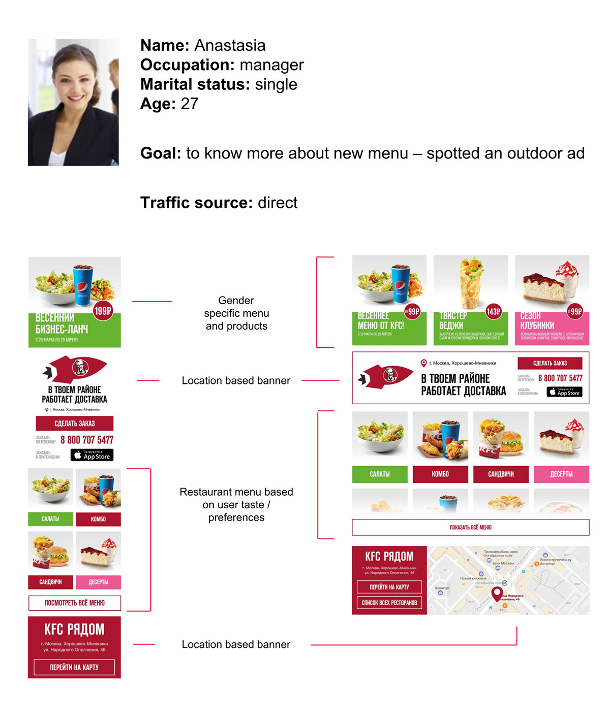
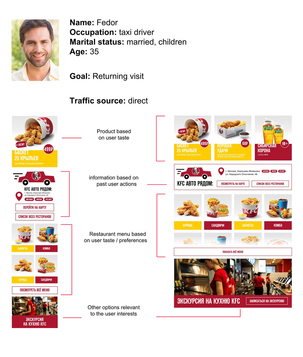
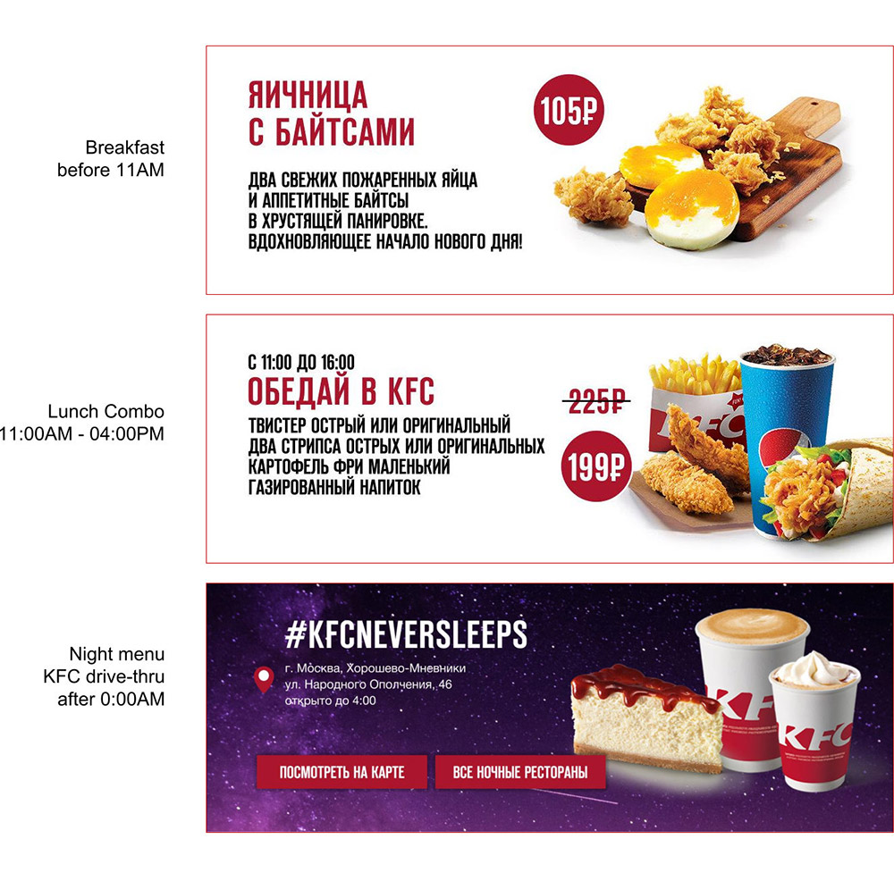
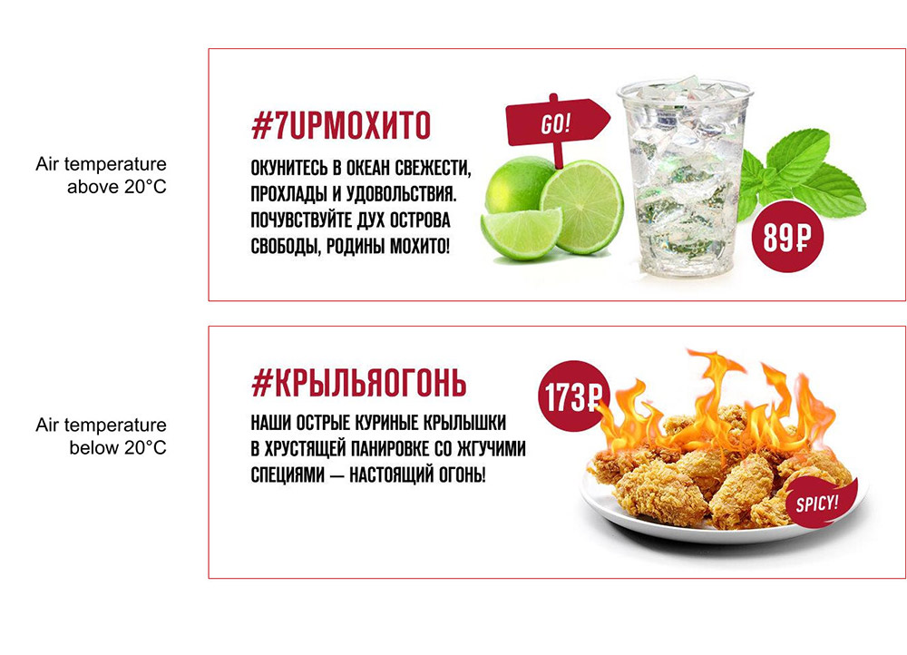
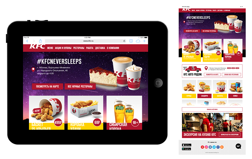
Moreover, different banners and products load depending on weather, gender, age, location, time of day.
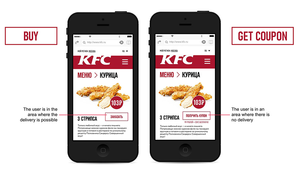
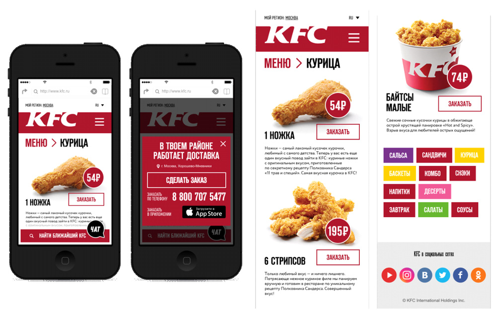
84% of the customers were browsing the KFC website while on a mobile device. So it was incredibly important to create a site that looked good on all devices, maintained its goal-oriented design, and followed a strong grid structure to keep everything tight and organized.
The new design was based on the personalization of the content and adaptability for the customer’s individual needs. These findings acted as a guiding principle during the whole design process.

Anton possesses a winning combination of solid tech skills and business sense. He has an expert knowledge of user behavior, needs and pain.
— Rossano Rolla, De Fonseca

Anton quickly and efficiently achieves his goals thanks to his responsibility, focus on results, deep understanding of user needs.
— Sergey Doroshko, LETO

Anton is a clear expert who has a vast knowledge of UX and demonstrates a deep understanding of users.
— Roman Soroka, KupiVIP

Anton has an excellent eye for design and usability, he is a self-starter and a problem solver.
— Kirill Semkin, Spacebox