Portfolio / Hyundai Solaris Website
When Hyundai released a new Solaris model in Russia, the site was supposed to help buyers find out the main advantages of the new model, but something went wrong.
I was tasked to improve the user experience and retention by uncovering user pain points.
My Role
I was a part of the agency team and responsible for UX Audit of the new Hyundai Solaris website.
What I did
- Analytics
- Interviews
- User Flows
- Wireframes
- Mockups
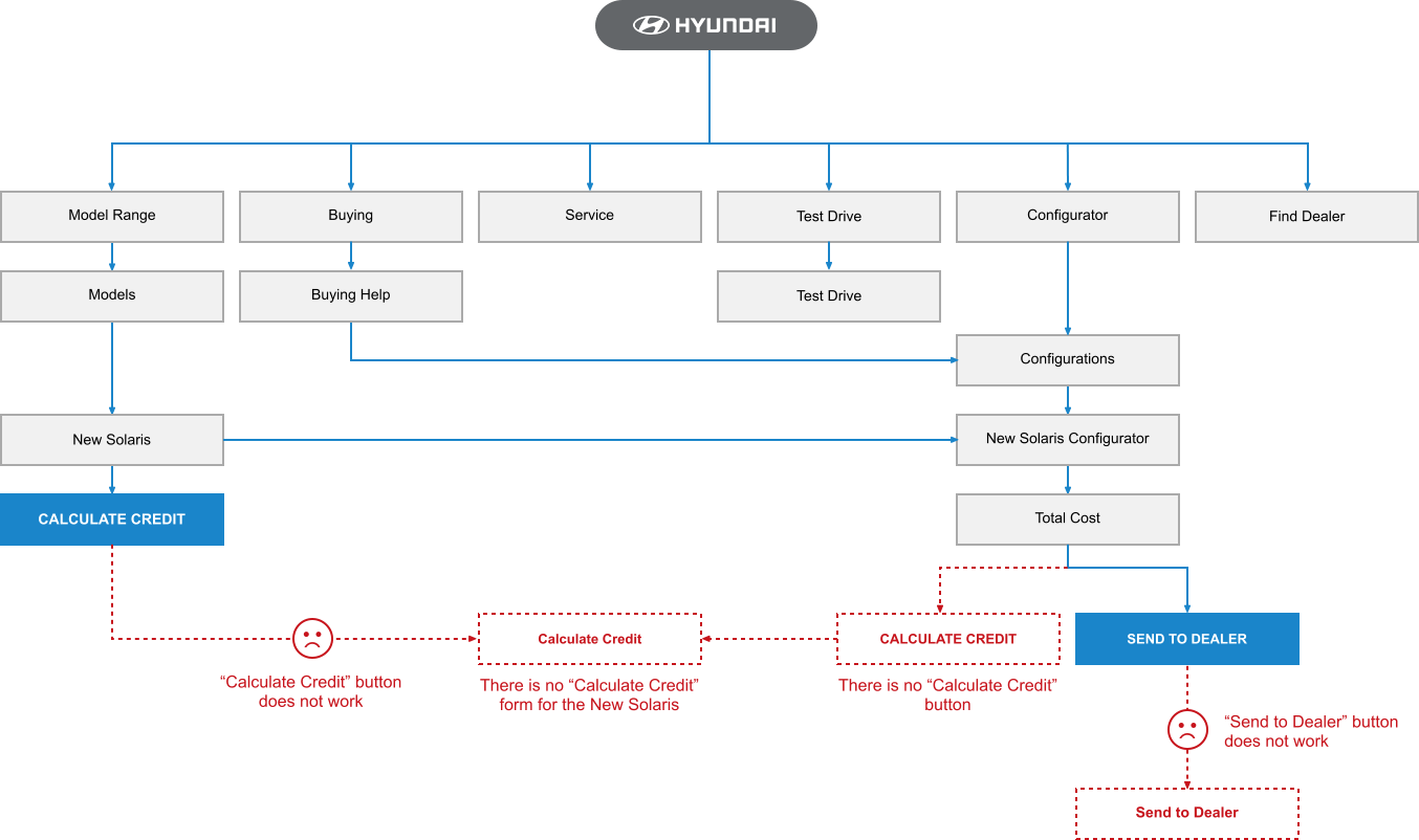
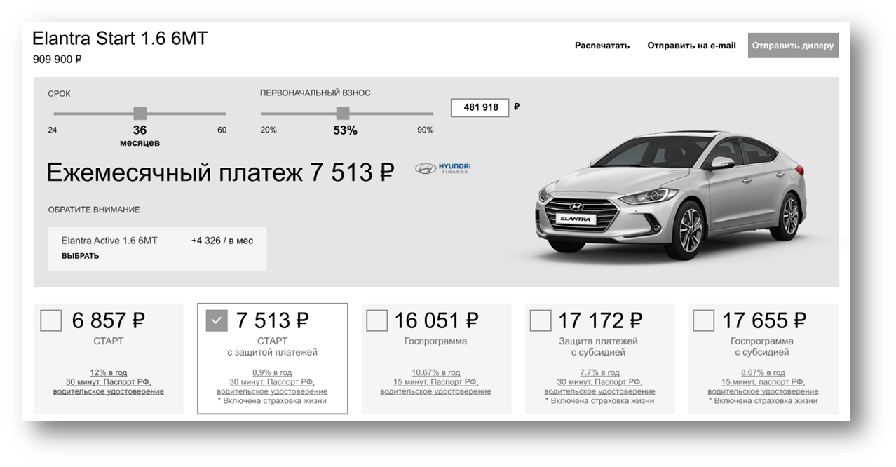
The visitor fell into a funnel, at the end of which he could perform several actions: calculate a loan to buy a new car, find the right configuration, arrange a test drive or visit a dealer.
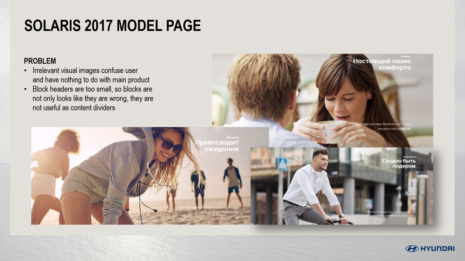
Outdated information, irrelevant and confusing images, overcrowded designs and a tangled user path were all contributing to major usability issues.
I analyzed every page of the site to build a new user flow and remove all obstacles. I conducted about 15 interviews, watching how users navigate, perform tasks and feel while visiting the site, how they are interacting with the interface to reach the goals.
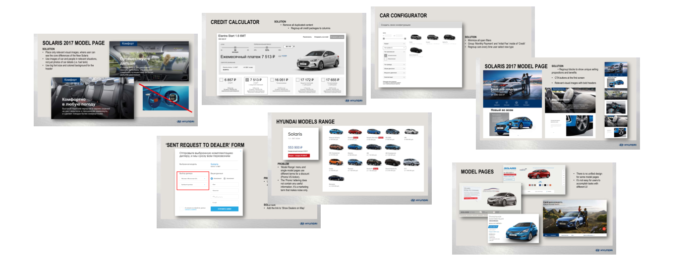
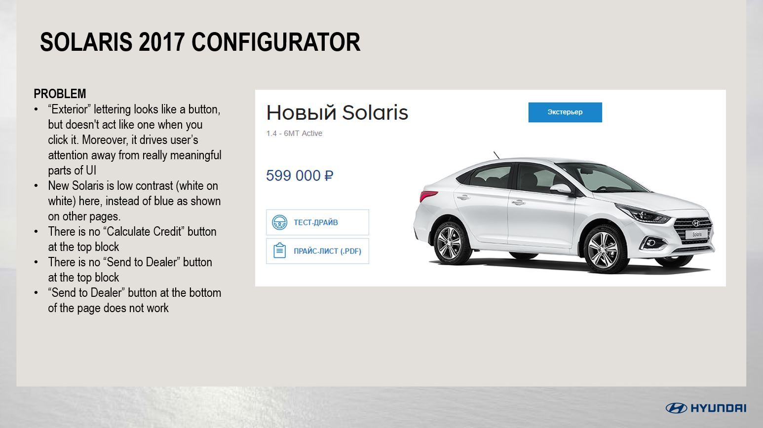
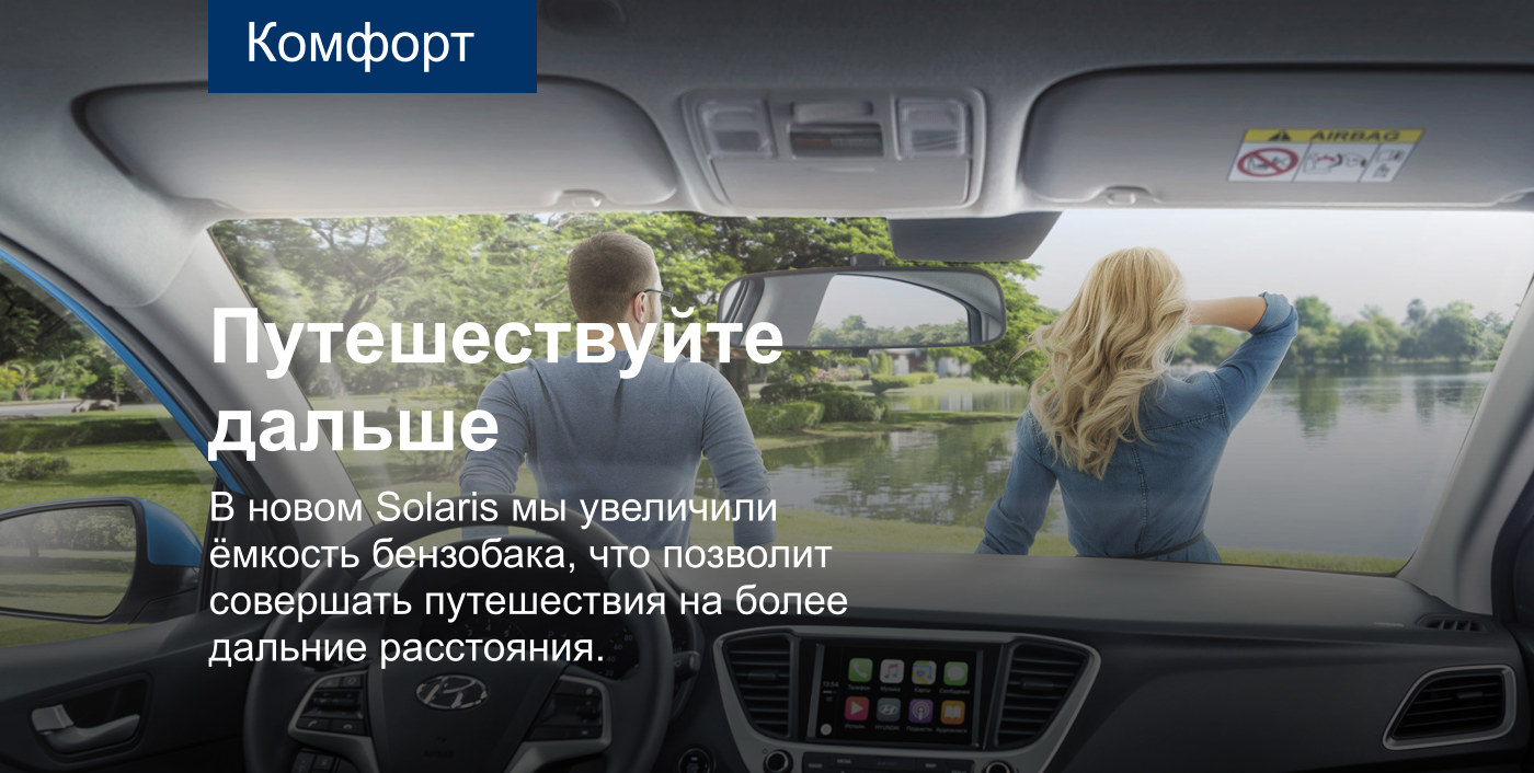
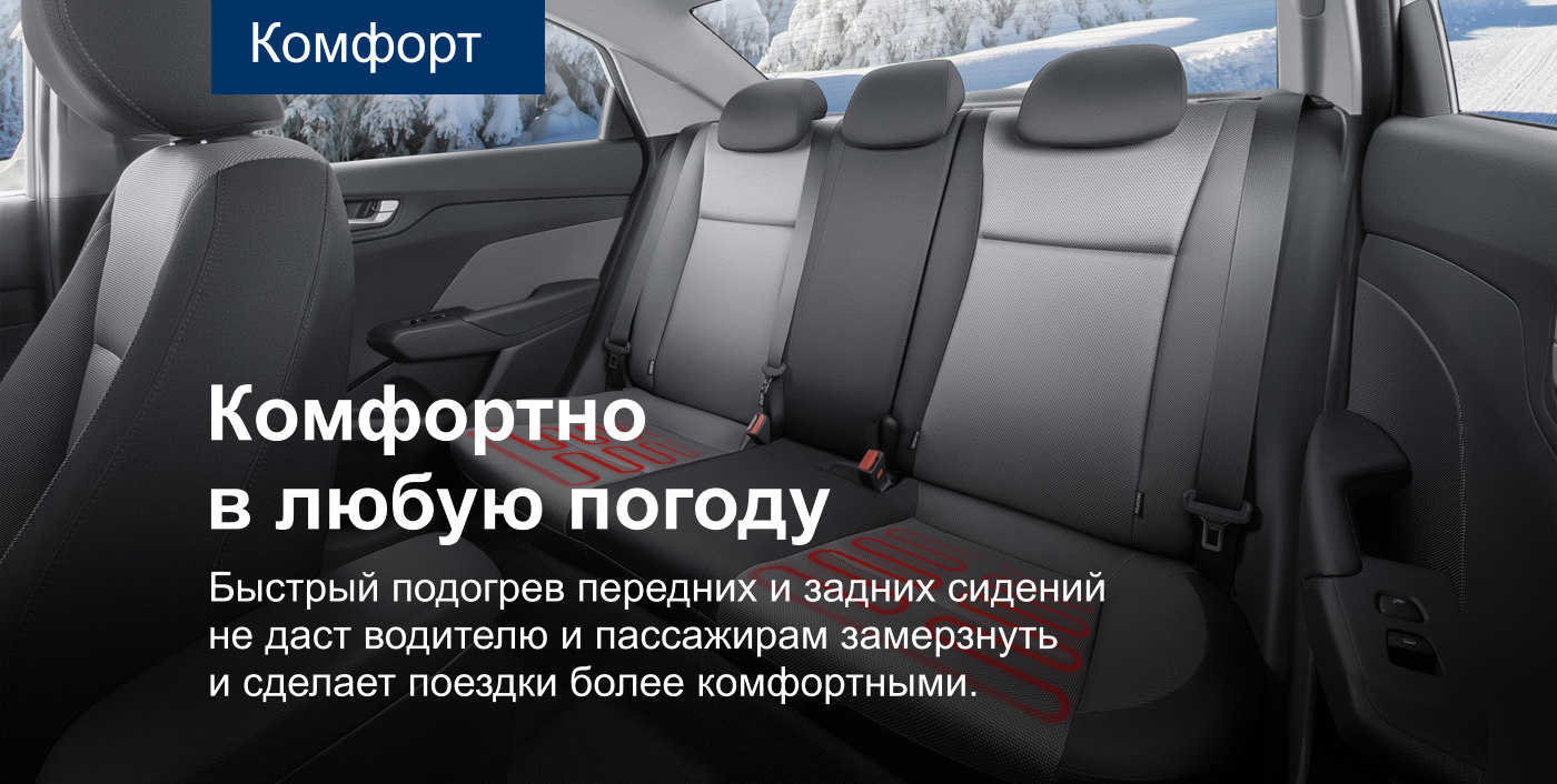
The result of the work was a multipage document with wireframes, mockups and recommendations for improving the user experience.


Outcome
The redefined Solaris website soon became a huge part of the Hyundai digital marketing campaign.
The reworking of user flow and redesign of key pages increased lead submits for test driving and purchase applications.
The newly designed information architecture increased the visibility of the key features and improved the overall organization and navigation throughout the website.

Anton possesses a winning combination of solid tech skills and business sense. He has an expert knowledge of user behavior, needs and pain.
— Rossano Rolla, De Fonseca

Anton quickly and efficiently achieves his goals thanks to his responsibility, focus on results, deep understanding of user needs.
— Sergey Doroshko, LETO

Anton is a clear expert who has a vast knowledge of UX and demonstrates a deep understanding of users.
— Roman Soroka, KupiVIP

Anton has an excellent eye for design and usability, he is a self-starter and a problem solver.
— Kirill Semkin, Spacebox