Portfolio / Bud AR App
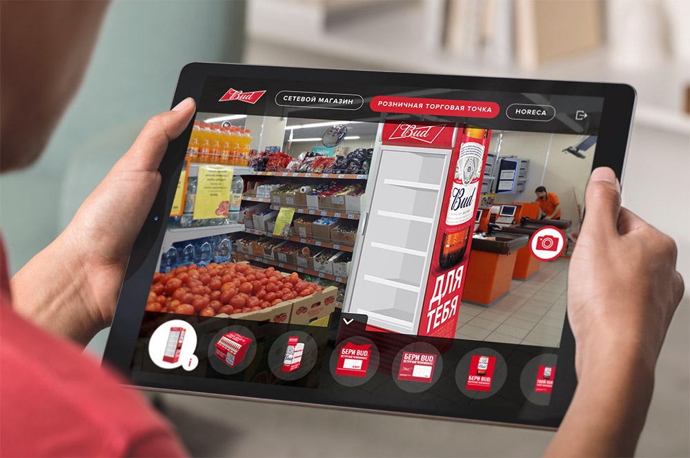
With more than 50,000 points of sale in Russia, AB InBev wanted a digital solution to help its merchandisers organize shelves, set up displays and promotional signs. The Bud brand was chosen for this pilot project.
My Role
I was the sole designer responsible for both user experience and visual design. I did user interviews and user testing, built a prototype, and collaborated with iOS engineers to develop the prototype into a final product.
What I did
- Interviews
- User Flows
- Mockups
- Prototype
I was a part of a multidisciplinary team that worked with AB InBev. Since Bud merchandisers already used iPads we came with the idea of an augmented reality tablet app. I was tasked with ideation and exploring what merchandising AR app might look like.
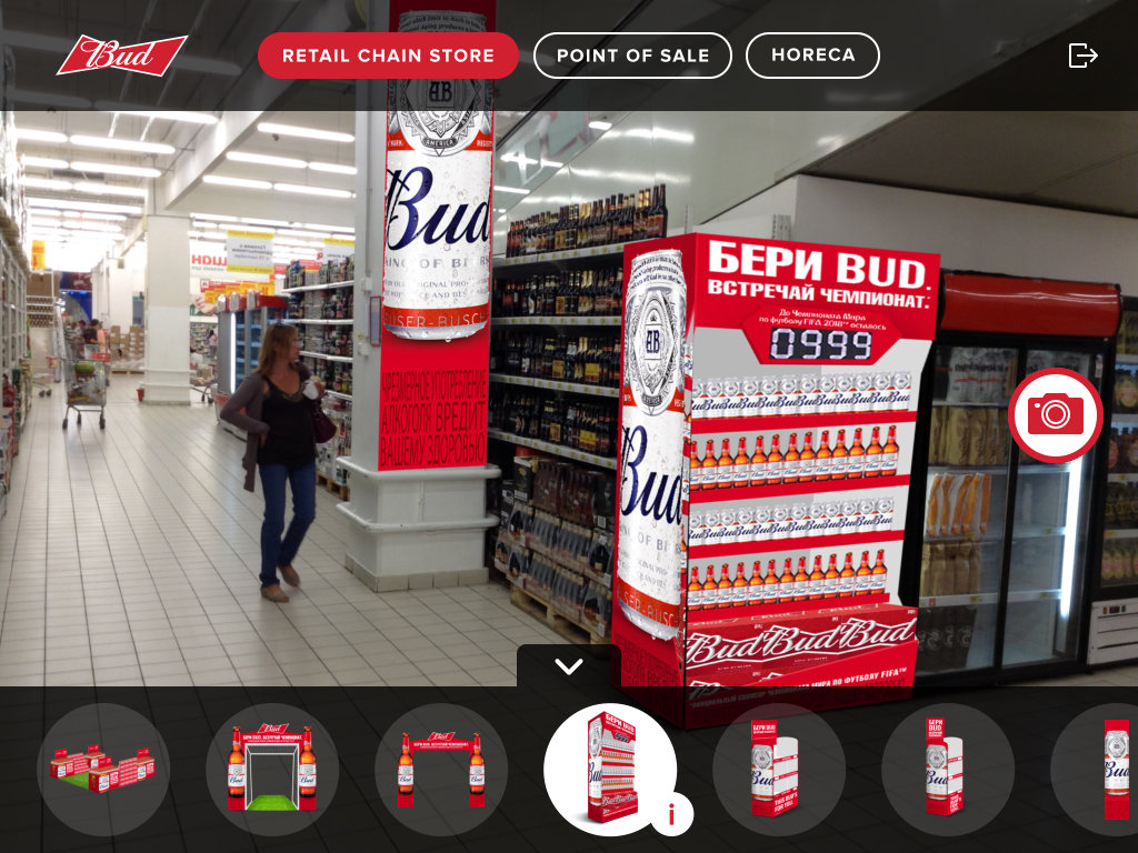
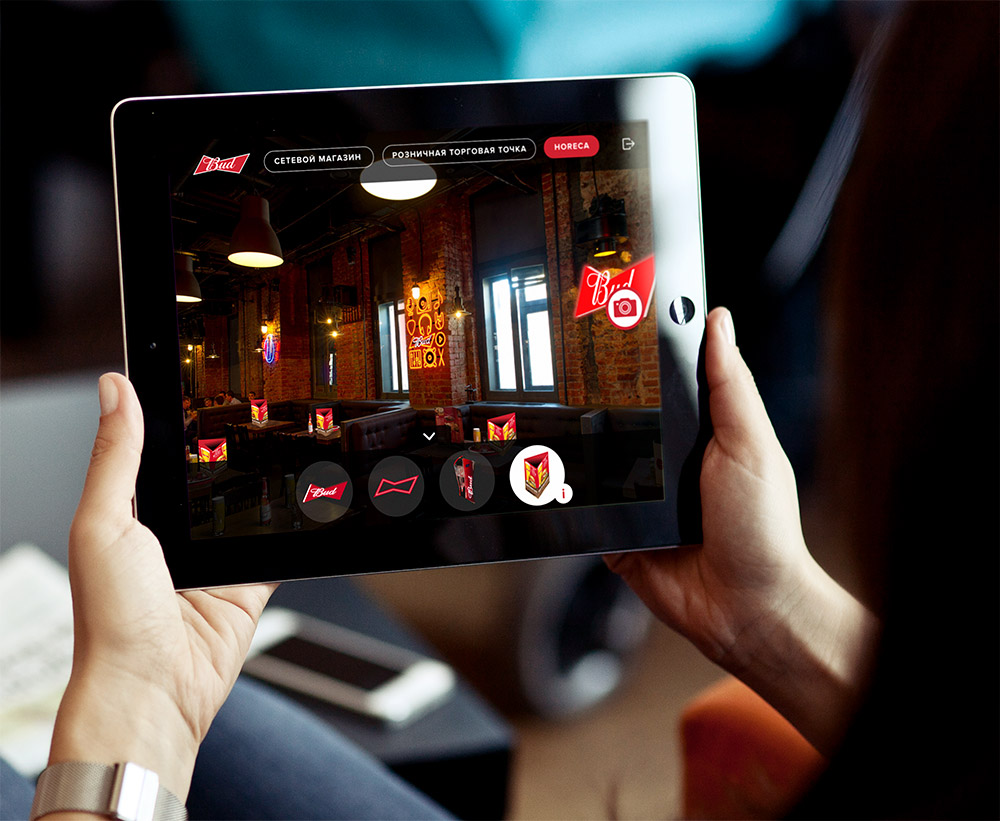
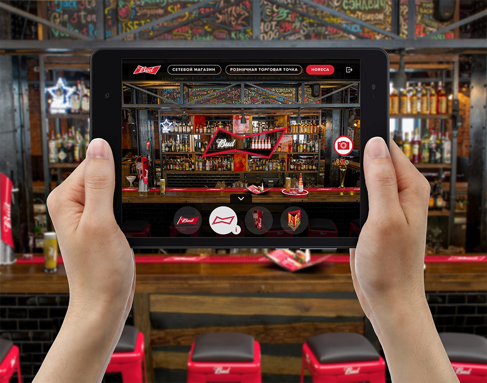
My main goal was to create a simple and effective experience through which users would be able to place promotional signs, stands, and displays in a real environment.
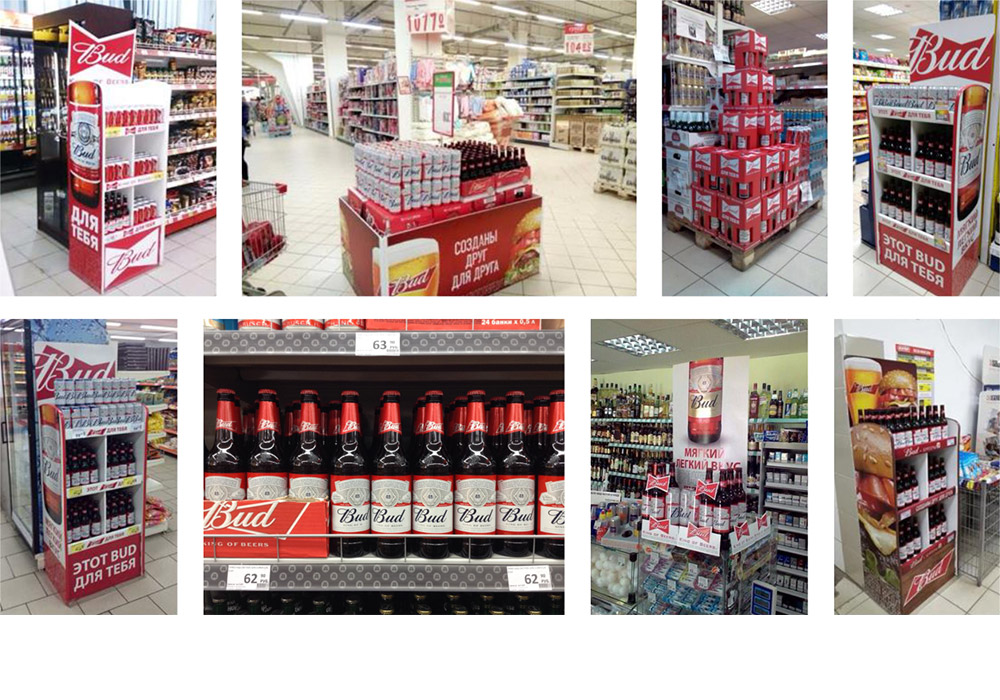
I visited several stores and took pictures of real spaces that could be used for promotional signs placement.
After that, I worked with 3D designers to make models of objects used by Bud merchandisers to place them into the app.
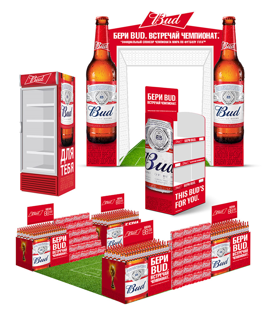
I conducted several interviews and discussions with company employees and merchandisers. The surveys and interviews revealed a few insights I used to develop the user flow. For example, promotional items were often confused due to the large number. So I decided to lock general parts of the app until a user will finish the onboarding and learning part. Also, the information blocks and instructions were created for every item.
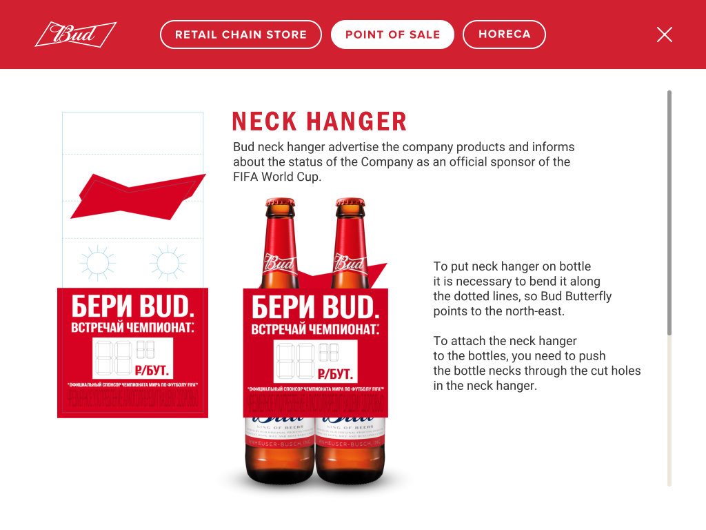
Most of the work I’ve done for Bud isn’t disclosed to the public and is only available to internal personnel. On this project, I executed user flows, wireframes, mockups, and interactive prototype. I cannot show the whole process except for a few screens.

Anton possesses a winning combination of solid tech skills and business sense. He has an expert knowledge of user behavior, needs and pain.
— Rossano Rolla, De Fonseca

Anton quickly and efficiently achieves his goals thanks to his responsibility, focus on results, deep understanding of user needs.
— Sergey Doroshko, LETO

Anton is a clear expert who has a vast knowledge of UX and demonstrates a deep understanding of users.
— Roman Soroka, KupiVIP

Anton has an excellent eye for design and usability, he is a self-starter and a problem solver.
— Kirill Semkin, Spacebox